Last updated: October 29, 2026
Room-by-room decorating works best when each space solves a different problem: the living room needs seating and conversation, the bedroom needs calm, the kitchen needs durability, and small spaces need visual order. In this Room-by-room decorating ideas — The Complete Guide, the quickest answer is to give each room one clear job and build around it. If the whole home feels scattered, the fix is not buying more decor; it is choosing one clear function for each room and decorating around it.
I write about interiors with a bias toward real-life constraints: small budgets, awkward layouts, mixed furniture, and rooms that have to work on weekday mornings, not just in photos. The best decorating plan is usually the one that looks intentional from the doorway and still holds up when the laundry basket is out.
Key takeaways
- Start with the room’s job, not its style. Function tells you what to buy, what to skip, and where to spend.
- Use scale as the first design decision. A too-small rug, lamp, or art piece can make a room feel unfinished faster than the “wrong” color does.
- Repeat 2 to 3 materials or colors across a home so rooms feel related without looking identical.
- The most common decorating mistake is filling every blank wall. Leave some visual rest.
- Small rooms usually need fewer pieces, stronger storage, and more light—not more “tiny” decor.
- The right room-by-room plan balances durability, comfort, and maintenance, not just taste.
- For practical planning, room-size choices matter: a 7-by-10-foot rug or a 60-inch console can change how a room reads.
How should a living room be decorated?
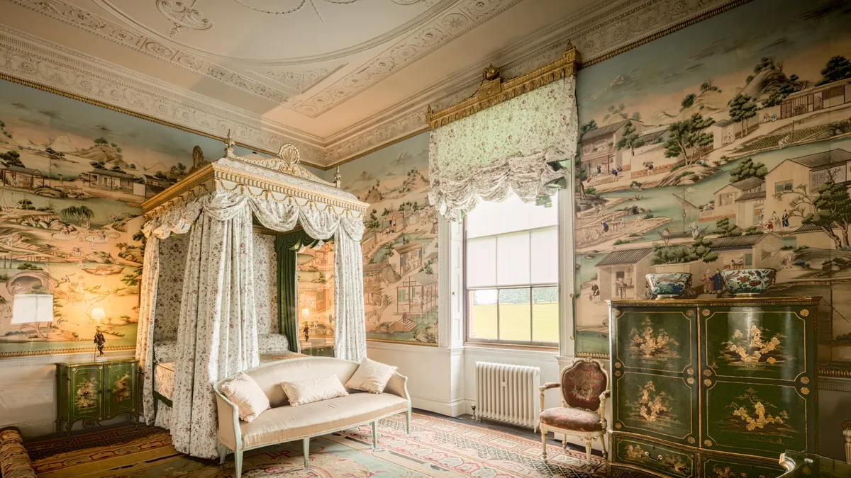
A living room should be decorated around seating first, then layered with lighting, storage, and one or two focal points. This room-by-room decorating rule matters most here, because a sofa, rug, and coffee table have to relate to each other before any pillows or art can do their work.
The strongest living rooms usually follow a simple sequence: anchor the seating area with a rug, define the main conversation zone, then add task and ambient lighting. A rug that is too small can make the room look disjointed. As a practical rule, the front legs of major seating should sit on the rug, or the rug should clearly contain the whole seating group if the room allows it. For art, one large piece over a sofa often looks better than several small frames spread too far apart. A sofa wall also benefits from a lamp, plant, or side table so it does not feel like a showroom backdrop. The room can also justify a 7-by-10-foot rug or a 60-inch console when the proportions call for it.
The real strength of living-room decorating is flexibility. It is the one room that can handle a sharper pattern, a darker wall color, or a louder accent chair better than most other spaces. That makes it ideal for experimenting with a 7-by-10-foot rug, a 60-inch console, or a bolder artwork scale than you would use in a bedroom. The downside is also obvious: it becomes cluttered quickly. Too many pillows, side tables, baskets, and decorative objects make the room feel busy instead of welcoming.
This approach is best for households that actually use the living room for sitting, talking, reading, or watching TV. It is not for rooms that need to serve as a toy dump, office, and storage zone at the same time. If the room has to do three jobs, the first decorating move should be zoning, not styling. For layout help, the National Association of Home Builders is a useful starting point for space-planning basics, and Better Homes & Gardens has practical room-layout examples.
What works best in a bedroom?
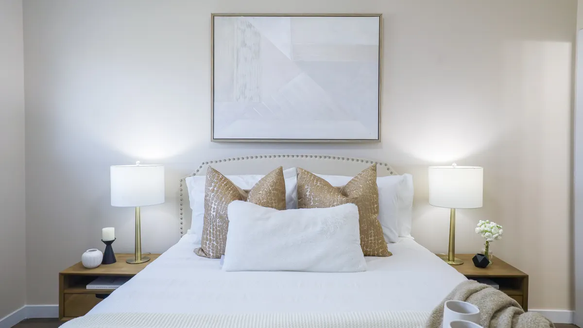
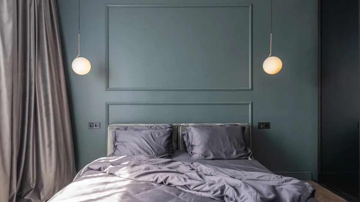
A bedroom works best when the decor lowers visual noise and keeps the bed area symmetrical or intentionally asymmetrical. The bed is the room’s anchor, so every choice should support sleep, not compete with it.
The best bedroom plan usually starts with a clear headboard choice. A headboard gives the bed a finished edge, especially in rooms where the bed sits on a long blank wall. Matching bedside lamps or sconces help the room feel calm because they create balance without requiring a lot of objects. If there is room for only one piece of art, place it above the headboard or opposite the bed where it can be seen on entry. Nightstands should be sized to the bed rather than to the floor space alone; tiny bedside tables often make a room feel improvised, not airy.
The honest trade-off in bedroom decorating is that “cozy” can easily turn into “crowded.” Heavy drapery, multiple throw pillows, and lots of small decor items can make a bedroom look styled in photos but annoying in daily use. A bedroom also needs more negative space than a living room because it is viewed mostly from one angle and used for rest. That is why a low dresser, one bench, or one chair often beats a room full of extra furniture. For sleep-focused guidance, the Sleep Foundation explains why the bedroom environment matters, and The Spruce offers practical bedroom layout ideas.
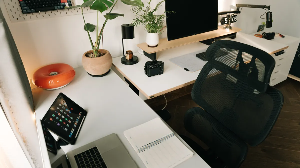
This approach fits anyone who wants a room that feels calmer at night and easier to keep tidy. It is not for a bedroom that doubles as an office and needs a large desk, extra task light, and visible storage. In that case, the room should be divided into sleep and work zones so the decor does not fight the function.
Dining room decorating ideas that don’t feel stiff
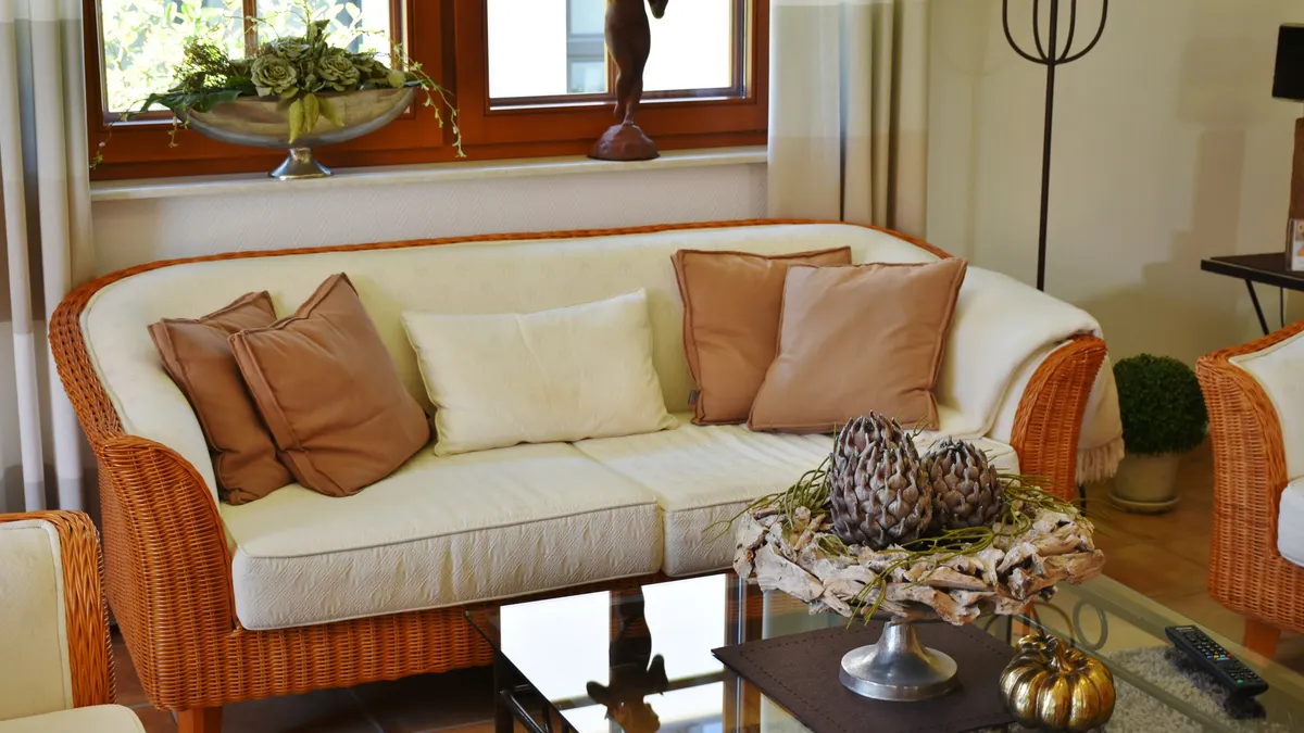
A dining room should be decorated to make the table the clear focal point while keeping the room usable for moving chairs, serving food, and cleaning up. The simplest way to do that is to build the room around a table, a light fixture, and one storage piece, then stop before the room turns formal for no reason.
Dining rooms often look awkward when people treat them like a showcase, so if the space also needs to handle real meals or frequent use, consult a professional designer or organizer for the layout. A large rug can help, but only if the chairs can still pull out without catching on the edge. The chandelier or pendant should be centered over the table, not over the room itself, because the table is the active center. A sideboard, buffet, or cabinet adds both function and visual weight; it keeps the room from looking like a table floating in an empty box. If there is wall space left over, one oversized artwork or a restrained gallery wall is enough. The American Society of Interior Designers is a credible place to verify design-planning guidance, and House Beautiful has examples of dining-room styling that still leaves room to move.
The strongest dining rooms use texture to avoid stiffness. Wood grain, woven seats, linen-like drapery, or a matte wall finish makes the space feel more lived-in than a room made only of polished surfaces. A round table can soften a narrow room, while a rectangular table usually fits better in longer spaces. The drawback of the dining room is that over-decoration makes it hard to use. Too many centerpieces, fragile decor, or oversized chairs can eat up the practical space that dining actually requires.
This is the right formula for people who use the room regularly, not just on holidays. It is wrong for a dining room that has been turned into a pass-through, homework zone, or dumping ground; in those cases, the first fix is circulation and storage, not style.
How do I decorate a kitchen without making it busy?
A kitchen should be decorated lightly, because the best-looking kitchens are usually the ones where storage does most of the visual work. The goal is to add warmth and personality without crowding counters, blocking light, or making cleaning harder.
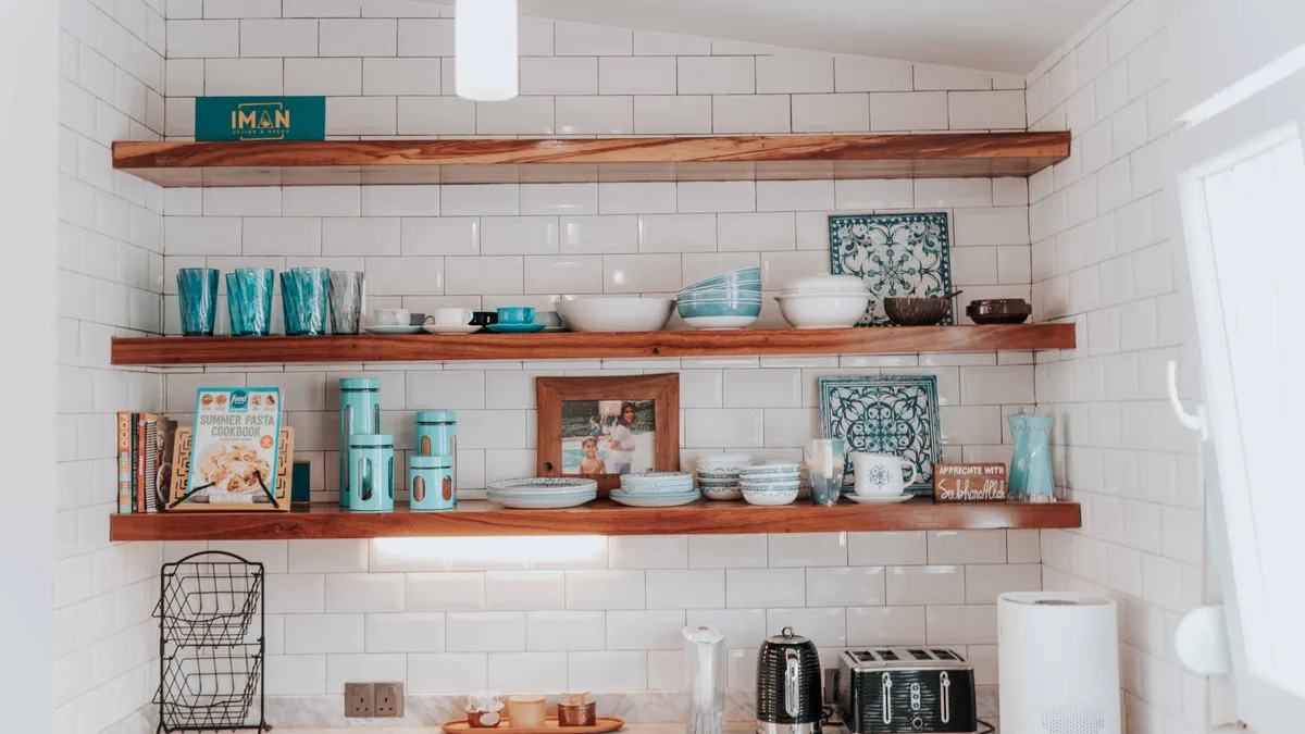
The most effective kitchen decor usually lives in five places: open shelves, counters, walls, windows, and the island or peninsula. Open shelves should hold only the items that are attractive enough to see often, such as matching bowls, glass jars, or a few cookbooks. On the counter, one cutting board, one bowl, and one small appliance grouping are usually enough. More than that often turns the room into a display case. A runner can soften a long galley kitchen, but it should not interfere with drawers or appliance doors. Window treatments, if used, should be easy to clean and should not block daylight. In a typical kitchen, the visual load is high, so a few objects often do more than a shelf full.
Kitchens need a different standard than living rooms because they are exposed to grease, steam, fingerprints, and heavy use. That means the best decorating choices are usually wipeable finishes, sealed surfaces, and decor that can move easily. A wooden tray, a ceramic canister set, or a low plant works better than delicate objects that collect grime. The drawback is that some “decor” belongs elsewhere. Large framed art, plush textiles, and high-maintenance accessories usually age badly in a working kitchen. For kitchen safety and materials guidance, Consumer Reports and This Old House both cover durable, low-maintenance choices.
This approach is best for kitchens that are already functional and need finish, not rescue. It is not for a kitchen lacking storage, task lighting, or counter space. In that case, storage upgrades matter more than decoration, because a beautiful kitchen that cannot hold its tools will never stay beautiful for long.
What should a bathroom look like when it’s decorated well?
A bathroom should look clean, simple, and deliberate, with decor that survives moisture and does not crowd the sink, tub, or floor. The room wins when it feels more like a calm wash space than a decorated room that happens to have plumbing.
The best bathroom decorating ideas start with materials that can handle humidity. Framed art should be kept away from direct splash zones, and textiles should be easy to wash or replace. A mirror with a substantial frame can give a plain bathroom more presence without adding clutter. Matching dispensers, a tray for daily items, and one plant or vase are usually enough on a vanity. If the bathroom has storage, concealed storage should do most of the work; open shelves should stay spare so the room does not feel crowded. For humidity and ventilation basics, EPA indoor air quality guidance is a reliable source, and Real Simple has straightforward bathroom styling examples.
Color matters more in a bathroom than people expect. Light colors can make a small room feel cleaner and more open, while darker tones can work if the room has good light and enough surface contrast. Tile grout, towel color, and metal finish should not all fight each other. One family of metals, such as brushed nickel or matte black, tends to read more intentional than a mix of several finishes. The downside is maintenance. Bathroom decor gets dirty faster, and anything with texture—woven baskets, fluffy mats, open toiletries—can start looking tired quickly if the room is not cleaned often.
This method is ideal for powder rooms and primary bathrooms that already have enough storage. It is not for a bathroom that lacks ventilation or has persistent moisture problems. In that situation, the first priority is controlling dampness, because decor cannot cover mold, peeling paint, or constant condensation.
How do I make small rooms feel bigger?
Small rooms feel bigger when the decor reduces visual breaks, keeps furniture scaled to the room, and lets light travel through the space. The answer is not to make the room empty; it is to make every object do more than one job.
The simplest small-room strategy is to choose fewer but larger pieces. A small rug can make the room look smaller because it chops the floor into pieces. A larger rug, if it fits, can actually expand the visual field by connecting the furniture. In the same way, one substantial mirror can help more than three tiny decorative mirrors scattered on different walls. Furniture with legs tends to look lighter than bulky block pieces. Closed storage also matters, because visual clutter shrinks a room faster than the furniture itself. In a compact room, a few inches matter, and that is why scale should be checked before color.
A small room also benefits from restraint with color contrast. Too many bold changes—from wall to trim to furniture to art—can make the space feel chopped up. Keeping the main surfaces close in tone helps the eye move across the room. That does not mean everything must be white; it means the room should have a controlled palette. Sheer curtains, a low-profile sofa, and wall-mounted lighting are useful because they free up floor area. The drawback is obvious: minimalism in a small room can read as unfinished if there is no texture, contrast, or personal detail. For small-space planning, Apartment Therapy and The Spruce both offer practical examples.
This approach is best for studios, one-bedroom apartments, guest rooms, and tight offices. It is not for people who love collecting objects or need lots of furniture in one room. If the room has to store too much, the decorating solution is usually built-ins, baskets, and hidden storage—not more styling.
Which room gets the biggest design payoff?
The living room usually gives the biggest design payoff because it is seen first, used often, and can change the mood of the entire home with just a few big choices. A better rug, sofa arrangement, and lighting plan can do more than a dozen small accessories in other rooms.
That said, the highest return is not always the room that gets the most attention. In a home where the bedroom feels chaotic or the kitchen feels cramped, those rooms may deserve the first budget. A bedroom with better lighting and a proper headboard can improve daily life more than a trendy accent chair ever will. A kitchen that finally gets functional storage can feel like a design upgrade even if no one would call it “decorating.” The right priority depends on which room causes the most friction.
The most common mistake is decorating rooms in isolation. A living room with warm woods, a bedroom with cool chrome, and a dining room with a totally different palette can make the home feel disconnected. Repeating one metal finish, two or three dominant colors, and a consistent wood tone helps the whole house feel coordinated without making every room identical. That continuity is especially useful in open-plan homes where sightlines run from one room into another.
The drawback of chasing the biggest payoff first is neglect. A dramatic living room makeover can make a hallway, bath, or bedroom feel even more unfinished by comparison. That is why the smartest order is often public room first, private room second, and utility rooms last unless they are causing daily frustration.
The honest side-by-side: room priorities and what wins where
The living room wins for statement pieces; the bedroom wins for calm; the kitchen wins for restraint; the dining room wins when it is anchored by one strong centerpiece; the bathroom wins when materials are moisture-safe; and small rooms win when scale is controlled. The best choice depends on the room’s job, not the trend.
| Criteria | Living room | Bedroom | Winner for this condition |
|---|---|---|---|
| Main goal | Social use, seating, visual impact | Rest, calm, privacy | Living room for entertaining; bedroom for sleep |
| Best anchor | Rug, sofa, coffee table | Bed, nightstands, headboard | Depends on the room’s function |
| Can handle bold decor? | Yes, in moderation | Only sparingly | Living room in larger spaces |
| Needs the least visual noise? | No | Yes | Bedroom |
| Tolerates open storage? | Sometimes | Rarely | Living room |
| Best for large art or statement lighting | Yes | Sometimes | Living room |
| Most sensitive to clutter | Moderate | High | Bedroom |
| Needs easy-clean surfaces | Moderate | Moderate | Tie |
| Best place for texture layers | Strong option | Strong option, but lighter | Living room for variety; bedroom for softness |
The practical takeaway is simple: decorate the living room to invite people in, decorate the bedroom to let the mind out, and never force both rooms to do the same job. The same rule applies across the home. A room that has to work hard should be decorated hard; a room that should feel quiet needs fewer decisions, not more.
When does the whole plan change?
The plan changes when the room is not a normal room: open-plan layouts, rental restrictions, kids’ spaces, and multiuse rooms all override standard decorating rules. In those cases, the room’s function beats its style every time.
Open-plan homes need boundaries more than decoration. A sofa, rug, lamp, and console can divide a living zone from a dining zone better than paint alone. If the room is rented, avoid permanent changes and spend on moveable pieces: rugs, lamps, curtains, art, and furniture with storage. Kids’ rooms need furniture that survives movement, mess, and growth; neutral decor can age better than theme-heavy decorating, which often feels dated fast. Multiuse rooms need zoning. A desk behind a chair, a bookshelf acting as a divider, or a rug under the work area can make a room function without looking chopped up.
There are also cases where decorating should wait. If a room has water damage, bad lighting, broken trim, or unsafe electrical issues, decor is the last layer, not the first. A beautiful chair cannot fix a dim, damp, or dysfunctional room. The same is true if the layout is wrong. A room with an oversized sofa, the wrong rug, or furniture blocking a walkway needs a reset before it needs new accessories. For repair and safety basics, This Old House and Bob Vila are useful references.
The verdict is straightforward: choose the room’s function first, then decorate to support it. Choose boldness where the room can carry it, restraint where the room needs rest, and practicality where the room gets the most use. If a room cannot yet hold its basic purpose, do not decorate it as if it can.
Drafted with AI; not yet reviewed by a person.